Miller Electric Mfg. Website
With Miller Electric, I learned quickly that my designs needed to consistently reflect the corporate values Miller takes pride in. Miller means power, reliability, and service that can be relied on. I worked with this client to produce designs that were conservative, intuitive, and above all, blue.
Objectives
- Logo usage must comply with corporate standards
- Consistent branding - Corporate color palette & Type Face
- Global Navigation Re-design - ease of navigation and usability
- Minimal file size and load time
- Organize content with appropriate hierarchy - placement and weight


Online Welding Projects
Miller offers a variety of fun extras for market segments. I worked with the client to design the Welding Projects section to be a place where welders will go for inspiration, plans, and tips for better welds.
Objectives
- Design a one-source page where users can find all the info they need
- Promote products, discussion, educational materials, and safety resources
- Develop a feeling of community
- Use a grid layout to create a visually cohesive page


Product Selector
I worked with Miller to design a user-friendly, consumer-oriented product selection guide. Selecting the right welding machine can often be a very overwhelming experience. With the SmartSelector, Miller recommends products based on the user's criteria, determined by answering a few simple questions.
Objectives
- Create a graphical web-based interface for product selection
- Simplify an overwhelming process
- Incorporate icons to make input values easily understood
- Make the user's next step clear with graphical and textual indications
- Use concise, descriptive verbiage
- Create a layout that offers clear comparison between recommendations
- Allow one recommended product to be the focus of the results page


Miller HTML Formatted e-Mails
Miller's online marketing includes HTML formatted e-mails. Some are scheduled e-newsletters that serve to create community and inform. Others are advertising placements for magazines that serve to generate site traffic and create awareness of Miller Electric and their products.
Objectives
- Lay out content in a narrower width for viewing in a mail client
- Write CSS and HTML to prevent mail clients from rendering poorly
- Keep code concise


Online Welding Resources
UW Oshkosh Alumni Relations E-News
This is a site I designed and built early in my web career. The goal was to have a news site that could be easily maintained via password protected admin pages. I selected a third-party content managing software and designed and implemented graphics and a custom layout. I wrote the help documentation for the back-end pages and training the client to upload images, write and edit content, as well as stage, archive, and publish issues.
Objectives
- Create a database driven, easily maintained news site
- Design a custom look and feel for third-party PHP code
- Write help documentation and train client to use the admin interface.

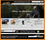
Jacobsen Golf Flash Animations
I have done a series of product flash animations for Jacobsen. Typically, the animation pans and zooms around a product application image with marketing copy transitions that correspond with key features illustrated in the photograph.
Objectives
- Generate product awareness
- Promote traffic to the product page
- Create excitement for the product

Hobart Welding Products
We are currently in the finishing stages of producing a complete site redesign for Hobart Welding Products. Hobart asked that we designed a site for them that would reflect their stature as manufacturer with a nation-wide distribution network.
Objectives
- Re-establish online corporate identity
- Adhere to consistent design standards site-wide
- Organize architecture & navigation to be logical and intuitive
- Use imagery that invokes excitement for products
- Use concise, descriptive verbiage


